What is UX Design, and How Does It Relate to Your Business?
You probably think that UX Design is yet another one of those catchy Tech buzzwords we hear these days. Or is it? Really, it is just a simple shortcut for the phrase “User Experience Design”. So why is UX Design so important to maximize your email marketing campaign results in recent times? Simply put, if the user has a good experience, the more likely they are to carry on reading, follow your advice in your email, and ultimately spend some money.
There are approximately 270 billion emails whizzing about trying to sell things, you just have to make your email stand out from the crowd. To be fair, they aren’t all concerned with your industry. But, there are literally thousands of potential customers out there just waiting to receive your perfect email newsletter, so you have to make it visually appealing and a pleasure to read.
How Important is Email Marketing?
These days, when just about everyone has an email address, it’s so easy to start an email marketing campaign that is truly effective. An email newsletter is most probably one of the best communication channels around at the moment because:
- It’s almost instantaneous.
- It is personal.
- It can be of any length.
- May contain hyperlinks to further information.
- It can contain attachments.
- You can send thousands at a time.
- But best of all, it’s free to send!
However, all that’s needed is a skilled author’s time and a clear plan of what you want to say and you will instantly have a winning email.
What About the Bottom Line?
As stated by Statista, for every dollar you spend on your well-thought-out email marketing campaign, you should generate an ROI of about $38. You can’t argue with those kinds of statistics. But you must construct your email marketing campaign carefully using UX Design, or you’re just flushing those dollars down the drain.
How Does Email Marketing Compare to Social Media?
According to McKinsey & Company, “Email conversion rates are three times higher than using social media.” Let’s have a quick look at why this might be with regard to a platform such as Facebook.
We can all agree that Facebook and its brothers and sisters have a huge effect on how people look at the world. Still, the biggest disadvantage of social media is that you need to actively subscribe to the platform and go to the trouble of logging on to Facebook, Twitter, or the rest.
By its very nature, the information on Facebook is transient. You read a message about a product, and before you know it, the page has refreshed and you lose the post you were reading. There is so much spam on social media with post after post from your colleague or best friend, vying for attention, that it’s a wonder the marketing post ever gets a view in the first place.
An email marketing newsletter, on the other hand, is both static and passive. When the user receives an email, it will sit in their inbox until deleted. Likewise, the account holder doesn’t have to do anything to receive your new email newsletter. As long as the account hasn’t got strict spam security settings, you can pretty much guarantee that the intended recipient will receive the email. Now all you have to do is ensure it’s read and doesn’t finish up in the spam box! You do this by presenting yourself and your message as something useful to read, and by giving them a great user experience.

How Can We Make Sure the User Has a Great Experience?
Using UX Design will ensure that the user has the best possible experience and there are certain principles to follow when designing your email marketing campaign:
- Make the information useful and usable.
- Make the information valuable.
- Ensure the reader finds the topic desirable.
- Make the information accessible and easy to find.
- Make it believable.
So, What Can We Do?
The end results of sending out an email newsletter are to gain the customer’s trust and loyalty, generate traffic on your website and increase conversions. Each of these depends on the successful completion of the previous one and you do this by making the information within the email, valuable; ensure that the customer enjoys reading your email newsletter and that they don’t regret clicking on the link.
Make a Great First Impression
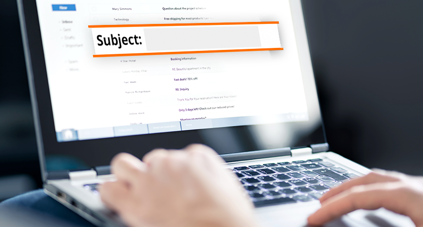
The first thing that everyone reads is the subject line. There is definitely a skill in writing these.

However, here are some basic rules to follow:
- Synthesize your entire email into one line, tempting the reader to open the email and continue reading.
- Don’t be too specific. Everyone’s requirements are different and all need a slightly different solution.
- Make the subject line valuable and useful to your customer.
- Impress on your reader that there is a time limit and it is in their interest that they carry on reading.
- Appeal to their curiosity. Say something unusual or strange.
- Let them realize that you know what you’re talking about and that you have the knowledge to pass on.
- Don’t shout at them by using upper case letters, or the email will end up in the spam box.
- Don’t use words such as buy, purchase, order, offer, or other promotional words. No-one likes hard-sell tactics.
- Most of all, keep it short and concise. People haven’t got the time to read long and involved subject lines.
Personalize Your Message
Keep the introduction informal and persuade the reader to identify with your content. In the back of their head, they know that they’re reading a marketing email, but it doesn’t hurt to be friendly.
Keep Things Consistent
Remember that your email newsletter, website, and social media posts should work together. Keep your company branding the same and the formatting as close as you can get across all platforms, so the reader never becomes lost when jumping from page to page.
Look for Images That Stand Out
Always use high-quality images that are easy to look at and combine them with easily read and relevant text. A well thought out image is worth half a page of text and can be assimilated at a glance. Not only that, but a picture can set the mood for the entire newsletter be it positive or negative. There is nothing worse than being confronted with a page of closely spaced text. People just won’t read it. On the contrary, use plenty of white space, subheadings, and images that tell the message and instruct the reader.
Design the Emotional Content of Your Email
Don’t neglect emotions by only giving dry facts, use layout and good design as well. For instance, use colors, images, and messages to appeal directly to your customer’s emotional center. In other words, let the designs tell your story in their own way. Learn more about how to create quality content, here.
Remember That People Use Different Devices
Adapt your email newsletter so that it can be opened by multiple devices. Most readers use a mobile device to open almost 50% of their emails and the number is growly steadily. Furthermore, many readers (about 80%) don’t even look at emails that aren’t adaptable. By not considering this relevant point, you run the risk of possibly losing hundreds of interested customers.

How Can I Properly Design My Emails?
Using UX design to construct a truly successful email marketing campaign is a mix between platform management, great design and plenty of empathy. All of these ingredients can send a meaningful message that keeps readers engaged and helps with long-term monetization. However, today’s market is so complex that many publishers simply don’t have the time to learn and develop creative, unique strategies for each campaign.
That’s where inboxAds steps in. With extensive experience in email marketing, this team helps publishers regardless of size to monetize their email campaigns with a plug-and-play solution.
With just a few clicks, inboxAds can offer a personalized plan of action tailored to your brand to turn your emails into revenue as quickly as possible.


https://waterfallmagazine.com
What’s up, I want to subscribe for this webpage to
get hottest updates, thus where can i do it
please help out.